Blog Archive

Monday 6 December 2010

cecil beaton & Julia Margeret Cameron

Cecil Beaton (1904 – 1980)
Cecil Beaton was one of the world's most successful portrait and fashion photographers. He used his talent in photography to capture celebrities and turn them into timeless icons. His most well known work is his photographs of Marilyn Monroe, Audrey Hepburn and Twiggy. He was also famous for documenting the British Royal family and weddings of the duke and duchess of Windsor.
Early career
Beaton was Raised in Hampstead by his timber merchant father, from a young age he grew fascinated with clothes appearances and stylish things and was a master of self-inventions. His first experience in photography was as a teenager when he photographed his sisters finely dressed and sent the results to a local newspaper. He was educated at Cambridge, which lead his to his partying with
London’s best.
He was a photographer for the British edition of Vogue in 1931. Horst Beaton is best known for his fashion photographs and society portraits. He worked as a staff photographer for Vanity Fair and Vogue in addition to photographing celebrities in Hollywood. Beaton's first camera was a Kodak 3A-folding camera. Throughout his career he used both large format cameras and smaller rolleiflex cameras. Beaton was never a highly skilled technical photographer; instead he focused on the staging of a scene and a model and looking for the perfect shutter-release moment.  Beaton had a major influence on and relationship with two other leading lights in British photography, Angus Mcbean and David Bailey.
 
The photographs of these three particlar celebrities are the most importants ones of Beatons work in my opinion because they where photographs of  celebrities at that time who beaton made into icons from the photographs. He has choose a particular style for each portrait in order to portray each celebs character. 

Julia Margaret Cameron  (11 June 1815 – 26 January 1879)
Julia Margaret Cameron

Julia Margaret Cameron was a British photographer. She became known for her portraits of celebrities of the time, and for photographs with Arthurian and other legendary themes. Cameron's photographic career was short, spanning eleven years of her life (1864–1875). She took up photography at the relatively late age of 48, when she was given a camera as a present. Her style was not widely appreciated but it still managed to have an impact on modern photographers, especially her closely cropped portraits. Her house is open to the public to see. 

"Annie, my first success",  1864. 
Cameron's first print she was satisfied with
Cameron was 48 years old when she received her first camera , she received it as a gift from her daughter which was the starting point of her photography career. Within a year cameron became a member of the photographic societies of london and scotland. Cameron wanted to capture beauty within her images she wrote ' I longed to arrest all the beauty that came before me and length the longing has been satisfied'  She used the basic technique of soft-focus 'fancy portraits' which where taught to her by David Wilkie Wynfield. 


Wednesday 1 December 2010

Commercial photography - Research and Ideas

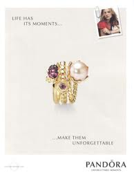
For my commercial object I wanted to use my pandora bracelet and do something more creative with it , I have researched pandora advertisements , ones that are officially used and ones that have been done from freelance photographers from flickr  to find inspiration for my photographs from them. Here are the photographs that i found. 

Official adverts


Although i like the images my plan is to do something slightly more creative rather than just photographing the bracelet , I would like to add things that remind you of winter as its the season at the moment and advertise the bracelets for christmas. I will bring in a grey  fluffy cushion to display the bracelet on , some white decorative branches from home and will try to purchase some beads of some sort , I would like to try different angles and  lighting , I think it would look effective with purple gels to go with the grey and white theme. 


 Here are the photographs I found from flickr slightly more challenging viewpoints and lighting. These are mote similar to what I would like to create. 


This is the effect I would like to create a more creative but professional  look. As it was snowing I decided to try out taking some photographs outside as I wanted to creative a festive theme , I will also take photographs in the studio to see the difference between the natural lighting and the studio lights. Here are the photographs from outside. 


I have edited them slightly to make the images brighter and sharper. Here are my favourite four images. 


Orignal image 

here is one of my final images after editing it, I have cropped the image so you can see the product more clearly and added a pandora logo,I didn't feel as though anything else needed doing to the photograph. I tried to use a similar colour scheme to the official pandora photographs in order to link the two. The grey and white colour scheme has been used also 

    I tried to make the photo look cold and metallic like the bracelet but use the pink and white colour scheme to soften the mood of the image to relate to the sophistication and elegance of the bracelet.


Here is another one of my four chosen photos to edit, as you can clearly see the colours are more saturated and the image isn't cropped, I decided to try and include a gift bag and two smaller pandora boxes to see how it would look, I like the overall look of the image but Im not sure if there two much in the image itself. 


Friday 26 November 2010

Objects - Mini Set Build

For the mini set build brief we was put in groups of four, my group was elliot, tom and sarah.  For a few weeks we were stuck for ideas and when it eventually got to the day before the brief date we started to panic, I decided to do a brain map as I found them useful in college, So i created a brain-map and asked the group what came to their head when they first thought mini set build, here is the typed up version of the brain map to give you an idea of the things we came up with. 

The main influence for the fist idea was my idea of photographing peoples drawers and what things people have inside them, I got my influence for this idea from Jim Goldberg , I researched his work and found an image which i then tried to do myself. We then took that idea and changed it slightly by the idea of using a wardrobe instead so then the objects would be more face on when you are photographing them. So are final idea was to bring in a wardrobe and our own personal objects , we then came up with a timeline idea, and I suggested we use luggage labels to label the objects with whatever we wanted. We had a slight problem with the wardrobe and bringing it in so elliot suggested he brought in a travel wardrobe which we also had a problem with as it had broke whilst on the way to uni.As are idea was starting to fall apart we came up with the idea of using a backdrop stand and using that in replacement of the wardrobe and to hang our objects on that instead. As it got to my go to place my objects and start setting up the lighting , I began to feel slightly less motivated and didn't like how the setup looked. Once I began taking my photographs I didn't feel as though my photographs were coming out the way I wanted to so I finished what i was doing and came up with another idea. The idea still relates to the group idea of places objects in cupboards and wardrobes etc. I decided to place my objects in a new storage cupboard that was in one of the classrooms, I wanted to create the same personal effect but show how important these objects where to me by giving the photographs a museum effect. So I decided to photograph my objects separately in the glass cupboard using a snoot to light the side of the cupboard and reflective board on the other side to stop the reflections on the glass. We also decided to take photographs of the setup of the wardrobe idea. Here are the images of the setup. 


Here is the setup of the lighting, we used different colour gels for each persons objects, for the first on we used red gels. We had two side lights at each side of the frame. 

Here are the initial idea photographs which I took. 


and here are the edited photographs from my first initial photo shoot. 

to get this old vintage effect I made the image black and white and then changed the colour balance to make it sepia, I then added an old paper layer and used the overlay layer effect to get this. I do like the overall outcome but I originally wanted to show more of the objects, which would look something like this. 

Here are the next photographs I took on a contact sheet 


I had to take more photographs than I normally would on a shoot because I didn't have a model lamp and I was working in the dark so I had to use a tripod and line up the camera in order to get the whole shot in, it took me a couple of times to get the right shot. As I took so many photographs , before I started to edit them I decided to narrow them down to my top 10 images so its easier to manage, I wanted to display my images in a series so they either look like they have been taken together in one cabinet or just so they all link in together. 
here are my top 10 images before edited. 


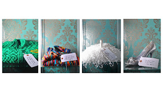
This is my final design with four of my chosen photographs, i decided to choose 4 items that not only go well together  but that mean the most to me in an age order, the first one is my first knitted school  cardigan from my nana at the age of 5 , a cardigan that my dad brought back when working in Australia at age 6, my morris dancing pom pom age the age of 5 and my latest object of my prom shoe from the age of 16. My other ideas of presenting these photographs where to make a small book and present each image on a page from each age. 

glass/reflective objects

I wanted to carry on the theme of using objects that had sentimental value to me, this meant I wanted to create a similar effect using natural light , artificial light and studio lights. We had to ensure our final outcome consisted of 4 images , two studio ones with different light setups one artificial light source and one with a natural light source. The object I choose was a crystal horse from which I had as  part of a collection as a child, some marbles from when I was a child and we also had to use a perfume bottle which Andy gave us for practice.As a group , me , Adam , Tom and Jardine decided to use natural and artificial light sources first and then come back to the studio. Here are my Natural light source images un edited.
Here are my favourite images before and after they have been edited.


I changed the saturation and brightness to make the colours stand out more and to make the shadows stand out more. My favourite image is the third one , I really like the bouccar effect . 


We also had to use artificial lighting , I didn't manage to find much artificial lighting that worked well with my perfume bottle i got given from andy, but I found one source of artificial lighting in the entrance of the university from the ceilings, I found a blue material stool and placed the blue bottle on that to get the lighting from the ceiling, here was the outcome. 


Its not one of my favourite photographs but I did tried to find lighting which would be subtle and work well with the object and I feel that this does. After using natural and artificial lighting I then went into the studio and experimented with different lighting. 


Tuesday 23 November 2010

Macro objects - test shots

My initial idea for the Macro photos where objects from my childhood that have sentimental value. I wanted to create a soft warm and welcoming feel as that is what the objects make me feel when i look at them .Here is my Contact sheet and my final image , I have decided to re-take my marco photographs in my own time  as I feel I need to spend more using the lights to create the right  effect I want.


Here is my final Image which I am going to re-take in my own time and re adjust the lighting.

Tuesday 9 November 2010

Blackburn Museum trip

Blackburn Museum trip 

On the 19th of October we had an organised trip to the Blackburn museum to help us with out objects brief. We were given a tour of the museum and was encouraged to take as many photographs of the historical objects as we could. To some of the students the historical objects that were on display wasn't an interest to them so they asked the museum employee Steve Irwin if they could look at any other objects that would be to their interest and to their surprise they was shown into the 'backstage' area where all the other objects where kept. Although I did take some photographs at the museum they weren't really to my taste or my interest and if i was to go back to Blackburn museum to look further into historical objects I think I would ask to see something more to my taste. Since the trip to Blackburn museum I have also thought about having a look around the Harris museum in Preston as its more convenient for me. 

These were one of the objects that caught my eye, As I thought it would be interesting to photograph the object on different angles as I have done here. This gave me the idea of photographing objects from your childhood which is a personal thing I would really like to do for one of the objects briefs. 


Again I look at the idea of photographing old books, and different ways of displaying them. 
Another Idea I had was for the set design, to photograph objects inside an old book with torn out pages, I think that would be interesting. 

These caught my eye as soon as I entered the 2nd floor , I find insects and their natural shapes interesting  , my Granddad collects insects in glass boxes just like these so I have been used to seeing them from a young age, It would be an interesting object to use , especially for macro. 


Tuesday 2 November 2010

Symmetrical image - wednesday 20th


we were set this brief on the wednesday by andy, we had to get into pairs and take face on portraits of one another in different locations such as the studio or outdoors. I was paired with sarah and we decided to go outside and take some shots in different natural light. I also wanted to use the studio to see what the different locations and lighting would do to the image and change the mood of it. As the studio was full we decided to take a trip down to the fire exit stair case which Andy told us had really good lighting, I struggled at first when trying to change my camera settings to fit the lighting but i feel that i have learnt a lot more about aperture and shutter-speed and how it works.
Once I had taken the photographs on the staircase i uploaded my chosen photograph from the staircase to photoshop to brighten to image I then used the marque tool to select half of the image 


I then selected the feather tool and selected the feather radius to 44 pixels


Then I went onto edit - transform - flip horizontal


After that I copied the image and made it into one single layer


This is the overall outcome of the left side


This is the overall outcome of the right side

I enjoyed this excersize and feel it has helped me to understand how to use photoshop more quicker and easier , as you can see I  have screen shots of how I edited and flipped the images I felt that this would help me in the future to look back and be able to do it again.