Brief
commercial photography - Research and Ideas
Course title Foundation Degree Photographic Media
Module title 04 objects; first semester; photographic principles
Tutor Katy Suggitt
Assignment title objects
This unit is intended to provide diverse opportunities to to learn fundamental photographic techniques associated with image production within a controlled environment.
The term 'Objects' is used in order to encompass not only photographing inanimate forms but also 'still life', close up wok and commercial products. These may include 'Pack shots', product photographing three- dimensional artwork and recording natural forms. Opportunities will be provided for the design and construction of 'sets' suitable for photographing more complex scenes.
Substantial Emphasis will be placed upon lighting theories and techniques, digital asset management and digital manipulation.
Learning Outcomes Assessed in this Assignment
- Understand fundamental theories of light, lighting and image capture
- Demonstrate an awareness of camera formats including digital and relevant film based systems
- Design and construct basic 'sets' working independently and as a member of a team
- Create darkroom and digital images using fundamental imaging, processing and image storage techniques
- Adhere to health and safety practice and regulation guidelines
- Demonstrate an awareness of the utilization of object based photography
Task
You are required to produce a paper based portfolio of 6 'objects' photographs. Whilst there are no strict instructions on the type of photographs, you must make sure you respond to each of the following study areas:
- Close up & Macro
- Mini set build
- Commercial product
- Highly reflective subjects (chrome, glass, etc)
- Historical objects and their narrative (with blackburn museum)
During the work carried out for unit 01 systems and processes assignment, you will learn several important lighting techniques. You should attempt to use these required skills to help you create atmospheric and expressive photographs.
You must accompany each photograph in the portfolio with a written evaluation of the work involved in tits production (research- design- treatment- post production) try to limit each evaluation no more than 150 words.
Your Portfolio size should be A4 minimum with images printed on suitable print media. Accompanying evaluations should be placed behind its relevant photograph.
Assessment Criteria
- Investigate research within controlled lighting environments with recorded evidence of technical terms and creative findings.
- Detail and accuracy of descriptions and evaluations for portfolio images
- Ability to work both independently and in a team, to produce effective and appropriate photographs
- Understanding of key areas/ genres of 'object' photography
- Attendance in appointed tutorials and lectures appropriate to the 'objects' assignment.
commercial photography - Research and Ideas
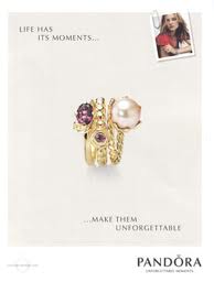
For my commercial object I wanted to use my Pandora bracelet and do something more creative with it , I have researched Pandora advertisements , ones that are officially used and ones that have been done from freelance photographers from flickr to find inspiration for my photographs from them. Here are the photographs that i found.
Official adverts
Although i like the images my plan is to do something slightly more creative rather than just photographing the bracelet , I would like to add things that remind you of winter as its the season at the moment and advertise the bracelets for christmas. I will bring in a grey fluffy cushion to display the bracelet on , some white decorative branches from home and will try to purchase some beads of some sort , I would like to try different angles and lighting , I think it would look effective with purple gels to go with the grey and white theme.
Here are the photographs I found from flickr slightly more challenging viewpoints and lighting. These are more similar to what I would like to create.
This is the effect I would like to create a more creative but professional look. As it was snowing I decided to try out taking some photographs outside as I wanted to creative a festive theme , I will also take photographs in the studio to see the difference between the natural lighting and the studio lights. Here are the photographs from outside.
I have edited them slightly to make the images brighter and sharper. Here are my favourite four images.
Increase of brightness & clarity
here is one of my final images after editing it, I have cropped the image so you can see the product more clearly and added a pandora logo,I didn't feel as though anything else needed doing to the photograph.
Here is another one of my four chosen photos to edit, as you can clearly see the colours are more saturated and the image isn't cropped, I decided to try and include a gift bag and two smaller pandora boxes to see how it would look, I like the overall look of the image but Im not sure if there two much in the image itself.
Mini set build
For the mini set build brief we was put in groups of four, my group was elliot, tom and sarah. For a few weeks we were stuck for ideas and when it eventually got to the day before the brief date we started to panic, I decided to do a brain map as I found them useful in college, So i created a brain-map and asked the group what came to their head when they first thought mini set build, here is the typed up version of the brain map to give you an idea of the things we came up with.
We also looked at a few examples of set build to get our own ideas flowing:
Here is the photograph that influenced my idea the most
The main influence for the first idea was my idea of photographing peoples drawers and what things people have inside them, I got my influence for this idea from Jim Goldberg , I researched his work and found an image which i then tried to do myself. We then took that idea and changed it slightly by the idea of using a wardrobe instead so then the objects would be more face on when you are photographing them. So are final idea was to bring in a wardrobe and our own personal objects , we then came up with a timeline idea, and I suggested we use luggage labels to label the objects with whatever we wanted. We had a slight problem with the wardrobe and bringing it in so elliot suggested he brought in a travel wardrobe which we also had a problem with as it had broke whilst on the way to uni.As are idea was starting to fall apart we came up with the idea of using a backdrop stand and using that in replacement of the wardrobe and to hang our objects on that instead. As it got to my go to place my objects and start setting up the lighting , I began to feel slightly less motivated and didn't like how the setup looked. Once I began taking my photographs I didn't feel as though my photographs were coming out the way I wanted to so I finished what i was doing and came up with another idea. The idea still relates to the group idea of places objects in cupboards and wardrobes etc. I decided to place my objects in a new storage cupboard that was in one of the classrooms, I wanted to create the same personal effect but show how important these objects where to me by giving the photographs a museum effect. So I decided to photograph my objects separately in the glass cupboard using a snoot to light the side of the cupboard and reflective board on the other side to stop the reflections on the glass. We also decided to take photographs of the setup of the wardrobe idea. Here are the images of the setup.
Here is the setup of the lighting, we used different colour gels for each persons objects, for the first on we used red gels. We had two side lights at each side of the frame.
Here are the initial idea photographs which I took.
to get this old vintage effect I made the image black and white and then changed the colour balance to make it sepia, I then added an old paper layer and used the overlay layer effect to get this. I do like the overall outcome but I originally wanted to show more of the objects, which would look something like this.
Here are the next photographs I took on a contact sheet
I had to take more photographs than I normally would on a shoot because I didn't have a model lamp and I was working in the dark so I had to use a tripod and line up the camera in order to get the whole shot in, it took me a couple of times to get the right shot. As I took so many photographs , before I started to edit them I decided to narrow them down to my top 10 images so its easier to manage, I wanted to display my images in a series so they either look like they have been taken together in one cabinet or just so they all link in together.
here are my top 10 images before edited.
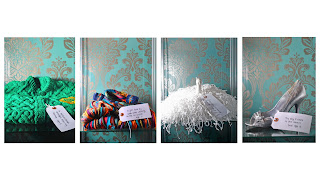
This is my final design with four of my chosen photographs, i decided to choose 4 items that not only go well together but that mean the most to me in an age order, the first one is my first knitted school cardigan from my nana at the age of 5 , a cardigan that my dad brought back when working in Australia at age 6, my morris dancing pom pom age the age of 5 and my latest object of my prom shoe from the age of 16. My other ideas of presenting these photographs where to make a small book and present each image on a page from each age.
Final Prints

Final Prints
Glass/reflective objects
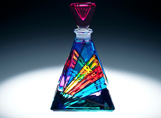
I wanted to carry on the theme of using objects that had sentimental value to me, this meant I wanted to create a similar effect using natural light , artificial light and studio lights. We had to ensure our final outcome consisted of 4 images , two studio ones with different light setups one artificial light source and one with a natural light source. The object I choose was a crystal horse from which I had as part of a collection as a child, some marbles from when I was a child and we also had to use a perfume bottle which Andy gave us for practice.As a group , me , Adam , Tom and Jardine decided to use natural and artificial light sources first and then come back to the studio. Here are my Natural light source images un edited.
Here are my favourite images before and after they have been edited.
I changed the saturation and brightness to make the colours stand out more and to make the shadows stand out more. My favourite image is the third one , I really like the bouccar effect.
We also had to use artificial lighting , I didn't manage to find much artificial lighting that worked well with my perfume bottle i got given from andy, but I found one source of artificial lighting in the entrance of the university from the ceilings, I found a blue material stool and placed the blue bottle on that to get the lighting from the ceiling, here was the outcome.
Its not one of my favourite photographs but I did tried to find lighting which would be subtle and work well with the object and I feel that this does. After using natural and artificial lighting I then went into the studio and experimented with different lighting.
i have looked at my reflective objects photographs and reviewed them carefully , I have decided to re take these photographs and do them at the Harris museum where there is currently a vintage glass/pottery exhibition open at the moment , this will challenge me as I will have to fill in a form in order to ask permission to take my photographs which is something new for me.
After considering going to the harris museum for my glass photographs I remembered that my nana collects perfume bottles from around the world so instead of going to the harris I have decided to use some of my Nan's perfume bottles instead. I have decided to do some research into antique and vintage perfume bottles to help me with ideas for lighting and viewpoints. I am going to look at amateur photographs on flickr and photographs from artists and famous photographers.
from looking at this image I can tell that there hasn't been much experimentation with the lighting, although I still find that the image works, it isn't over complicated and works well with the detailed perfume bottles and simple lighting.
I have found inspiration from this photograph in the way it has been edited, I am very fond of the old vintage look in photographs and think this has been done very well, I Will attempt to use the same rounded edges around the photograph when editing them.
After looking at this photograph I have considered using two or more perfume bottles in the photograph, using similar colours and lighting.
Here are some of my glass photographs as contact sheets:
Here are my top 4 images for each object
Here are four images I have decided to edit
Final print
Macro objects
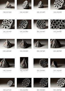
My initial idea for the Macro photos where objects from my childhood that have sentimental value. I wanted to create a soft warm and welcoming feel as that is what the objects make me feel when i look at them .Here is my Contact sheet and my final image , I have decided to re-take my marco photographs in my own time as I feel I need to spend more using the lights to create the right effect I want.
Here is my final Image which I am going to re-take in my own time and re adjust the lighting.
As I have decided to retake my macro photographs I have researched different objects that are used for macro photography, I have found these three top topics:
I found these through research and just looking at google images ,I feel that these two photographs of shells show how macro brings out the details and patterns in natural resources and I think it would be interesting to look further into shells as an object for my macro photographs.
Leaves/stems
Again these images are just from google images and I am going to further research my favourite objects further and look at artists who photograph these objects in macro. When looking at these objects I came up with the idea of using food coloring to dye the leaves to try and create a fine art look and bring out the natural patterns and lines used.
Fruit and Vegetables
Mushrooms
As I was trying to find objects which had different textures and patterns within them I realised that mushrooms where the best thing, These macro photographs have been taken so that you wouldn't know what the object was and you have to look very deep into the photograph to realise it was a mushroom.I would use different lighting and viewpoints to create different looking images to these.
Cabbage
Insects/human eye
When looking at macro photography i came across thee images , although i think this would be a good idea , I dont know if it would be practical for the college studio and also if it wold be classed as an object.
After looking at these photographs and having to consider practicality and appearance of the objects I have decided to further research into mushrooms and look at how artists photograph them in macro, shells and cabbage as I feel these objects have the most potential to work well with a macro lense.
Ron Van Dongen
After thorough research I found Van Dongen a still life photographer specializing in photographing flowers,I found these few photographs of mushrooms that caught my eye.
Edward Weston
another photographer who photographs food and natural forms is Edward Weston , He photographs objects such as mushrooms shells and peppers and tries to make them look less like food and more like an art form.
Macro photographs 1 -Mushrooms
Here are a selection of the photographs I took of mushrooms ,I tried to experiment with lighting, white balance composition and the general appearance of the mushroom to try to make it look more interesting and less like a mushroom through influence of Edward Weston. Here are my favourite selected images that I have edited to fit the photograph.
Macro Photos 2-Peppers
Macro photos 3-Natural Resources
After looking at my macro photographs and reviewing them carefully I have decided to choose two photographs from the natural resources section and present them together on the same page. Here is my final image to be sent to print.
Final Print
Blackburn Museum trip
On the 19th of October we had an organised trip to the Blackburn museum to help us with out objects brief. We were given a tour of the museum and was encouraged to take as many photographs of the historical objects as we could. To some of the students the historical objects that were on display wasn't an interest to them so they asked the museum employee Steve Irwin if they could look at any other objects that would be to their interest and to their surprise they was shown into the 'backstage' area where all the other objects where kept. Although I did take some photographs at the museum they weren't really to my taste or my interest and if i was to go back to Blackburn museum to look further into historical objects I think I would ask to see something more to my taste. Since the trip to Blackburn museum I have also thought about having a look around the Harris museum in Preston as its more convenient for me.
These were one of the objects that caught my eye, As I thought it would be interesting to photograph the object on different angles as I have done here. This gave me the idea of photographing objects from your childhood which is a personal thing I would really like to do for one of the objects briefs.
Again I look at the idea of photographing old books, and different ways of displaying them.
Another Idea I had was for the set design, to photograph objects inside an old book with torn out pages, I think that would be interesting.
These caught my eye as soon as I entered the 2nd floor , I find insects and their natural shapes interesting , my Granddad collects insects in glass boxes just like these so I have been used to seeing them from a young age, It would be an interesting object to use , especially for macro.
Final image for Historical object
Final image for Historical object
Diagnostic assignment
Through detailed research looking at still life and advertising photography I found two very different photographs, one photograph by Jim Goldberg a photographer who documented a lot of his travels , his image is simply a document of weapons which where confiscated going through customs placed in a draw. The other photograph is by David la chapelle a well known fashion photographer who is well known for his vibrant , surreal and humorous photographs, the photograph I have chosen of chappelles is an advert for 'skky vodka'.
I choose this image because I found the composition interesting, and found that the use of framing with the sky scraper buildings worked very well with the product. I found that the image focuses on the iconic blue bottle and try to draw peoples attention to the striking colour palette.I think that the shadows from the cocktail glasses contrast with the brightness of the image.
I came across this image whilst looking on the website www.magnumphotos.com which is a research resource that I found is very useful. The image caught my eye simply because of the interesting Birdseye viewpoint the photographer has used and it automatically generated ideas which related to this image in some way. I like how the photograph just happened and how it hasn’t been posed in anyway, the purpose of the image was to document an event rather than advertise a product to an audience. 

The idea for my own photograph through inspiration of this image was to take photographs of other peoples belongings inside their draws, as well as my own and document peoples belongings and see how others organise themselves as I believe that you can tell a persons personality and how they are by looking inside their draws as it tells a story about them, I think this would be an interesting photo shoot and I have tried it out around my house.
The above image is from a draw in the study/spare bedroom and I feel as though this image really captures that clearly from just looking at it. I think that the image isn't the best quality and hasn't got the best composition of framing but it tells a story in similar ways that Goldberg’s photographs do. From this image I can see clearly that the person isn't very organised and is very random.
other photographs taken: my bedroom
The kitchen
After researching and comparing the two different styles of photographing objects I have found that they are similar in the ways that both the images make you think about the concept and why it has been taken , as the sky adverts have a storytelling technique behing the images Goldbergs image also tells a story and makes you think about why he might of taken the photograph and for what purpose. Although both styles of photographing an image have simularities they also have different purposes , for example the sky adverts are designed to engange and invite consumers wheras Goldbergs image has been taken to document an event/information for people to see.
word count : 502
Chosen Photographs for print
Here are my six photographs that I have evaluated and decided to print for my final images.





No comments:
Post a Comment